VOSYN
When I joined the Vosyn team, I wasn’t just jumping into a project—I was stepping into a mission. Vosyn was aiming to create a video platform that made it easy for anyone, anywhere, to watch content in their own language.
For me as a designer, the challenge was clear: how do you take something so powerful, like AI translation and text-to-speech, and make it feel simple, familiar, and user-friendly?
From day one, I knew this wasn’t about just adding features—it was about making sure every feature felt natural to use.

THE CHALLENGE
Some of the key challenges we wanted to solve were
My Approach
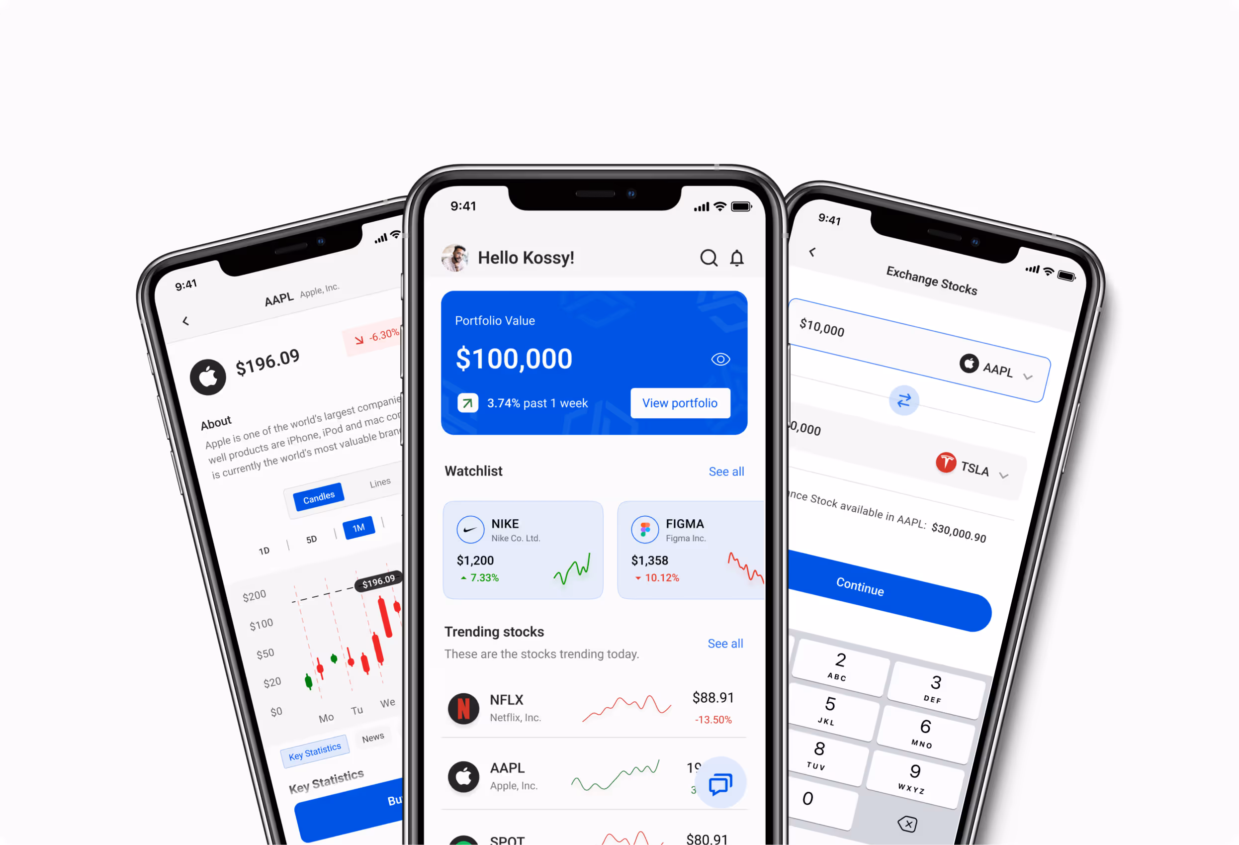
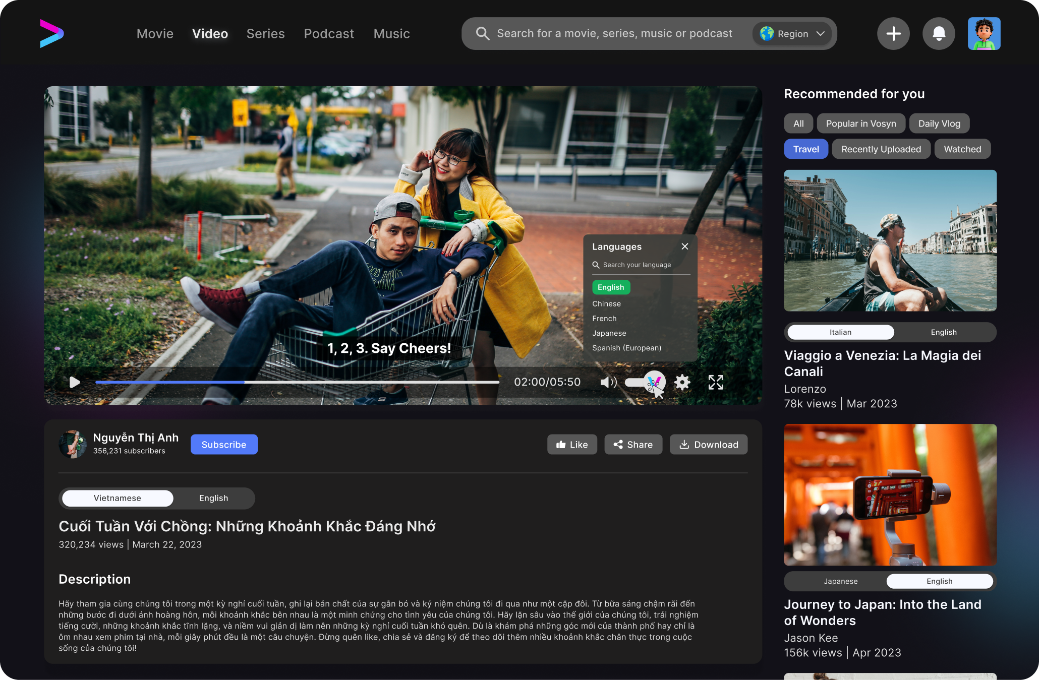
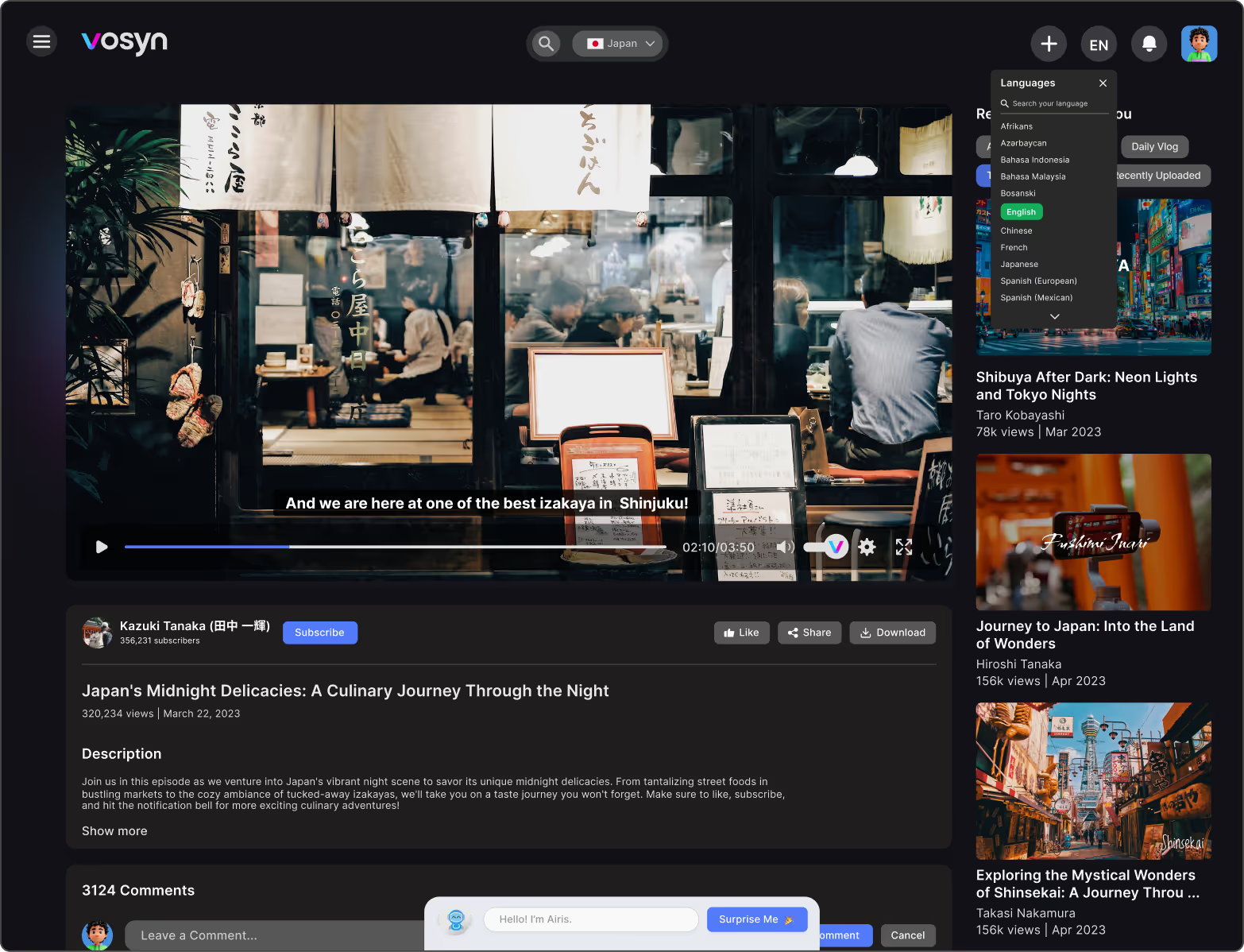
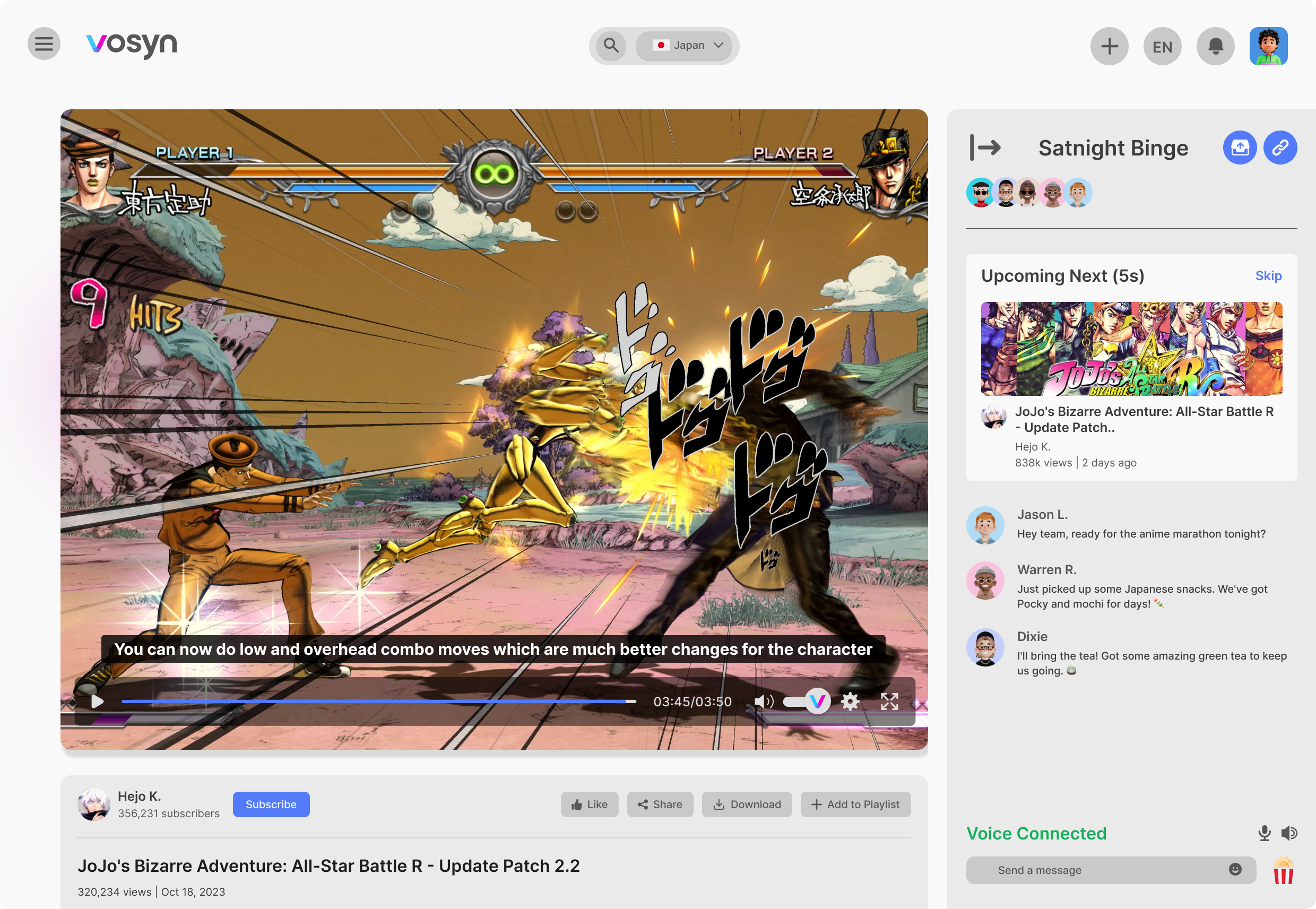
Language switching
At first, the language option was buried deep in the settings. But when we tested it, users either couldn’t find it or didn’t even know they could change the audio.
I moved it up front, right above the video with a clear flag icon and label—so it’s impossible to miss.
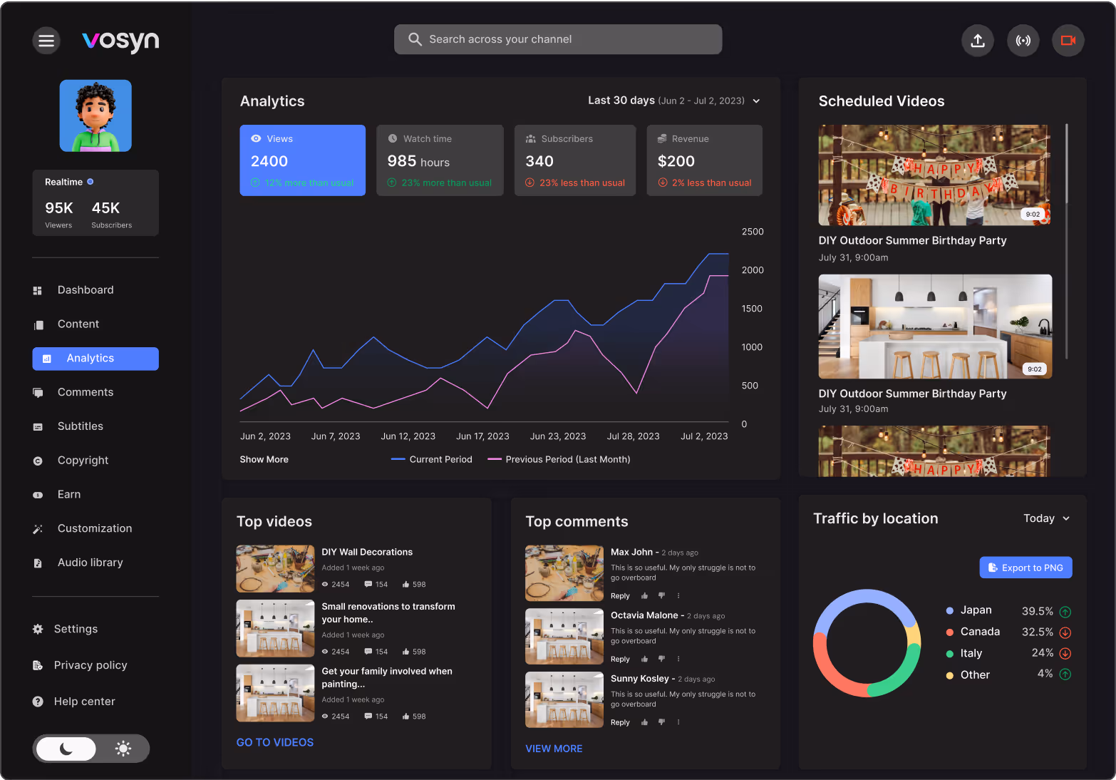
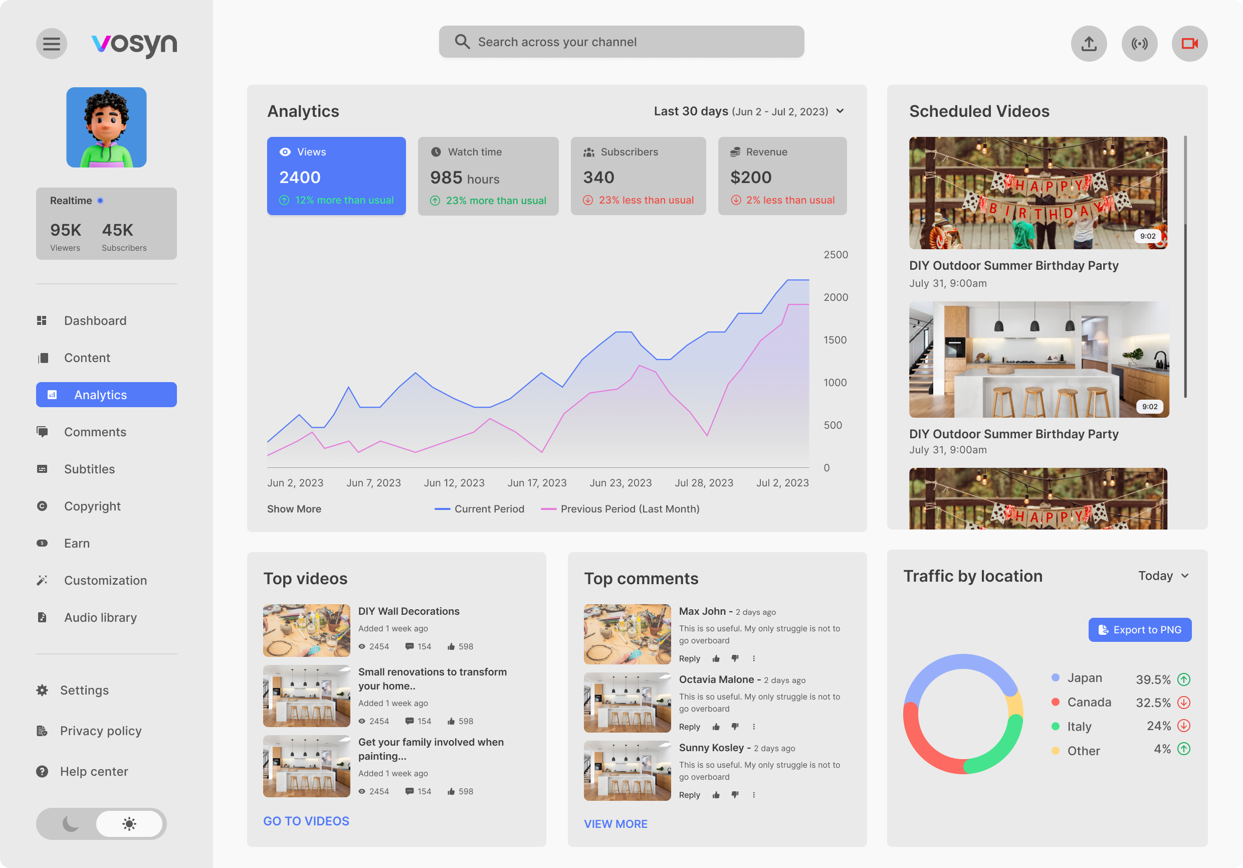
Making the Dashboard Feel Clear and Focused
Designing the Vosyn creator dashboard was a tricky balance. We wanted creators to see everything they needed—views, earnings, top videos—all in one place. But in testing, people told me it felt “a bit crowded” and hard to focus.
To fix this, I reorganized the page to highlight the most important stats first, and moved secondary info further down. This way, creators could get the key insights fast, without feeling overwhelmed.
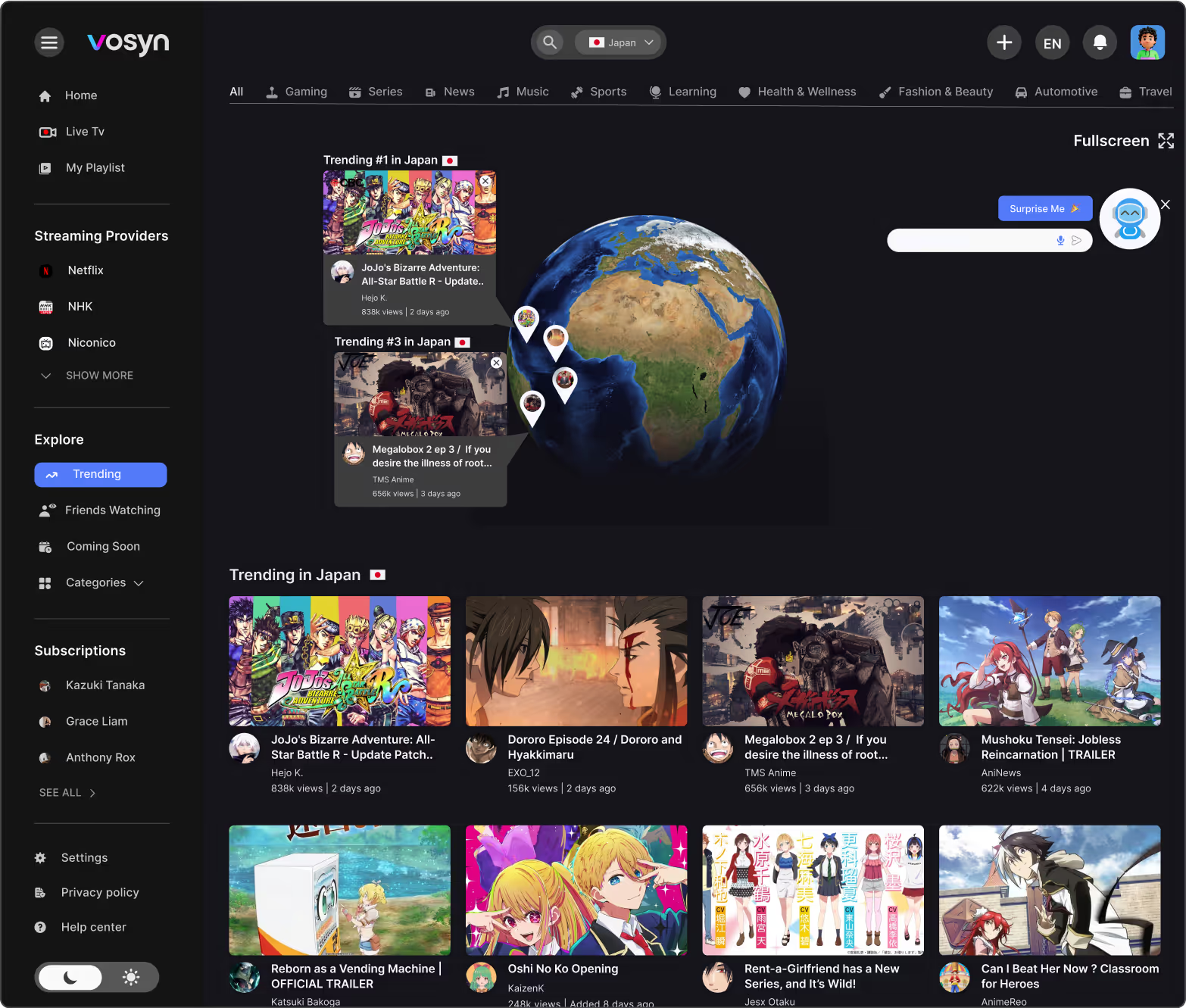
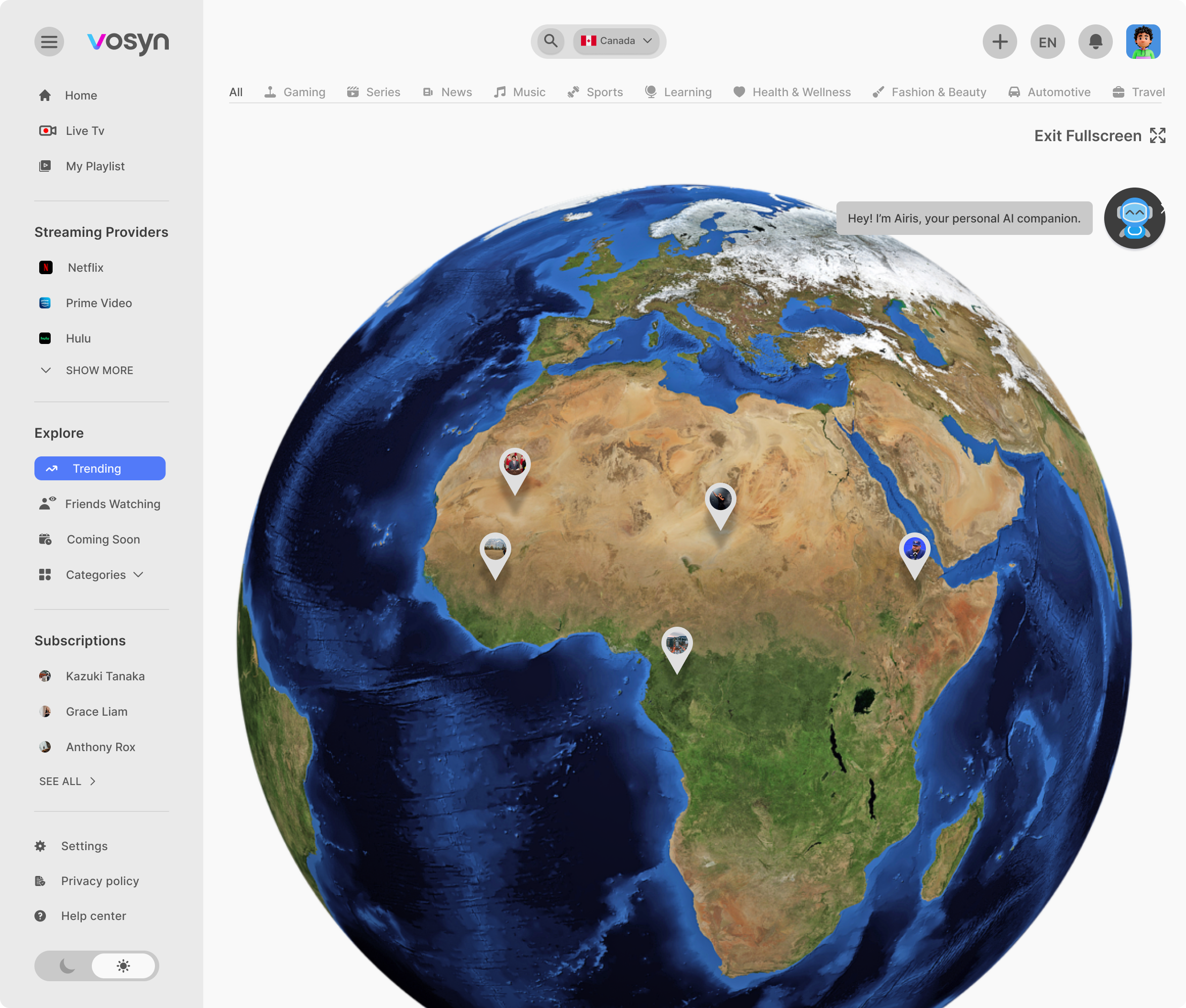
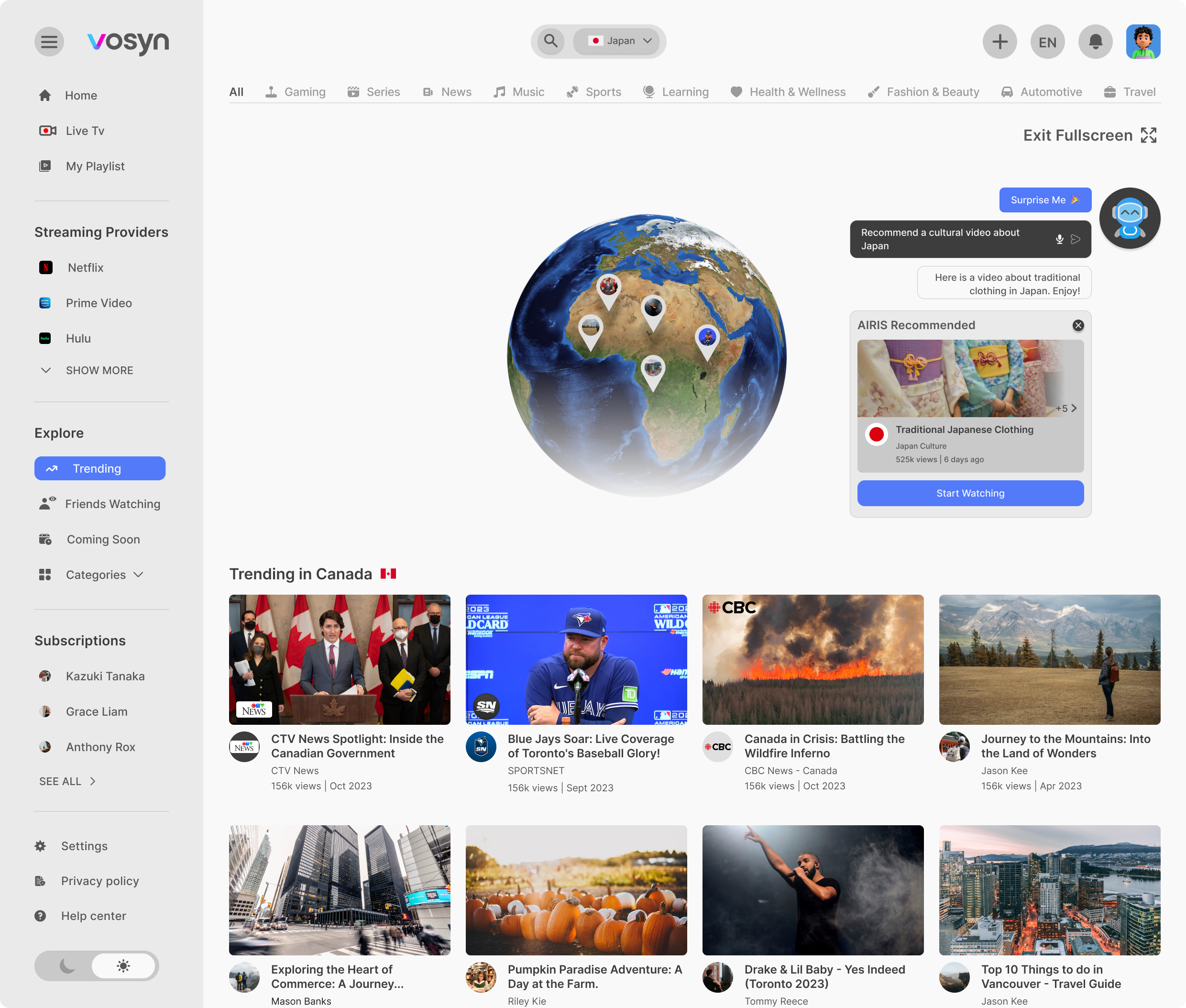
Making Global Trends Feel Simple
One of my early challenges with Vosyn was figuring out how to make global trends feel exciting without overwhelming users. I initially designed an interactive globe that displayed trending videos by country, but during testing, users found it “too busy” and didn’t know where to start. To address this, I simplified the experience by showing only the top three trending videos per region upfront, allowing users to explore more if they chose to. This small change made the feed feel more approachable and less chaotic.
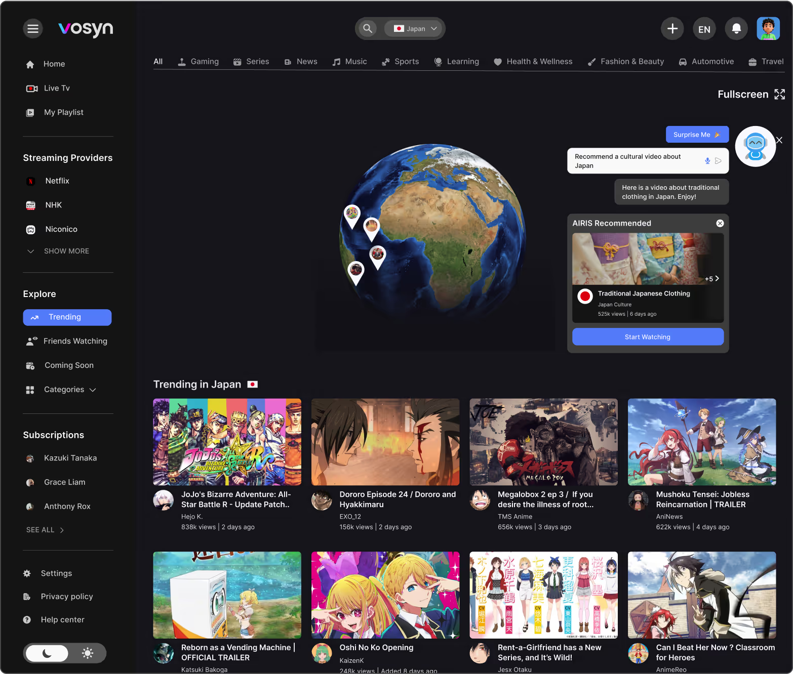
Airis recommendations
Airis, our AI recommendation tool, was tricky. The first design made it pop up right on the video—which users found annoying. I redesigned it so Airis stays in the sidebar or as a small suggestion bubble, so it’s there when you need it, but stays out of the way otherwise.
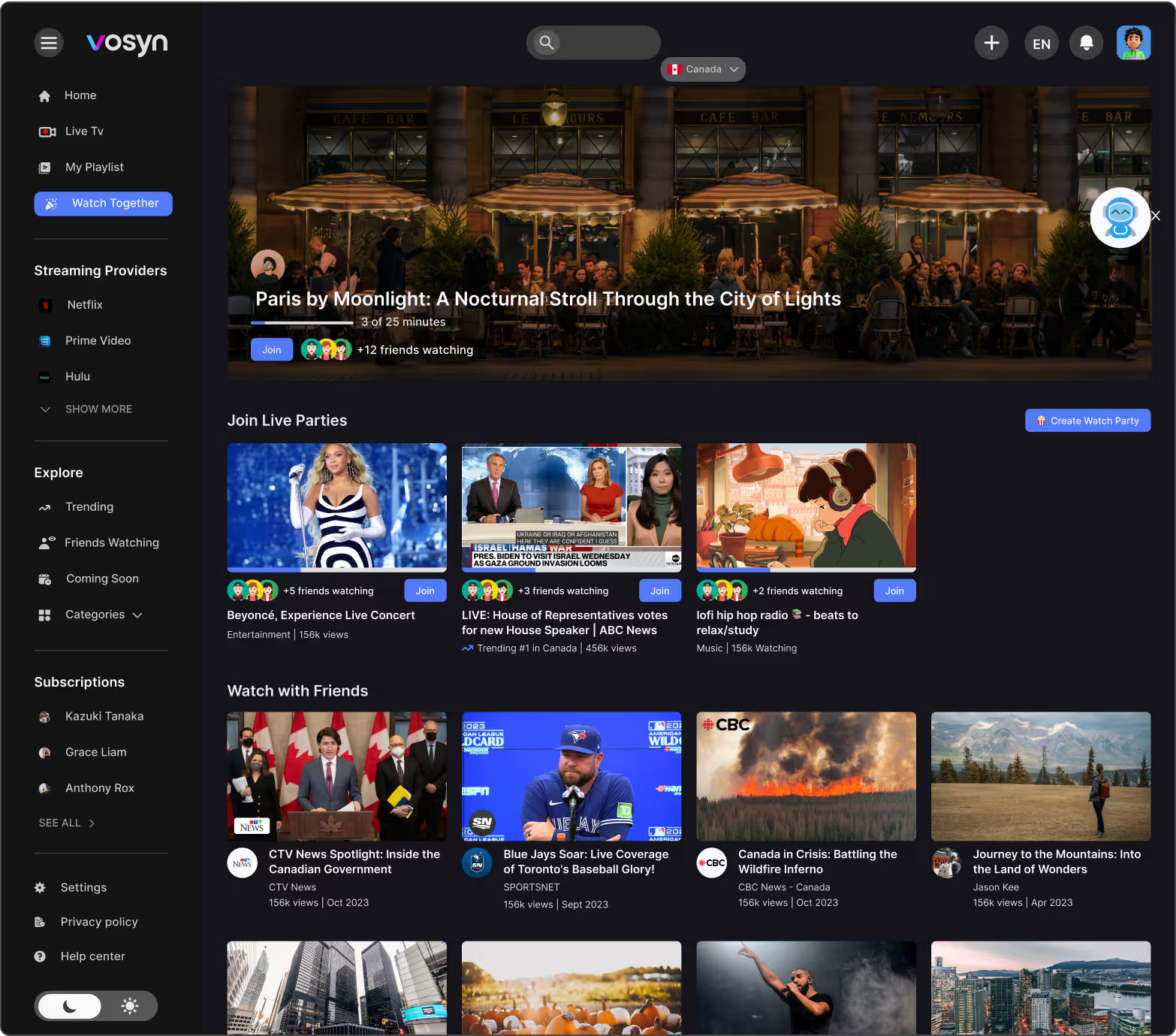
Watch Together feature
One of the coolest features—but also one of the hardest—was letting users watch the same video in different languages, while staying synced in a shared room. I designed the interface to let each person pick their own audio and subtitle language, while the video stayed synced for everyone in the group chat.
IMPACT
making global content feel personal, letting people enjoy stories from anywhere, without missing meaning
NEXT CASE STUDY