STOCKA
Stocka started out as a personal passion project. I’ve always been curious about the world of investing, but every time I tried using trading apps, I found them overwhelming—especially as someone without a finance background. I realized if I felt this way, a lot of beginners probably did too.

THE CHALLENGE
When I started researching existing trading apps, I kept hearing the same thing from people around me: “I don’t even know where to begin.” Many apps felt cluttered, filled with complicated graphs and numbers that didn’t make sense unless you were already an expert.
On top of that, the educational resources were either hidden or written in a way that wasn’t beginner-friendly. People wanted to learn—but they didn’t want to feel like they needed a finance degree just to get started. I knew that for Stocka to work, I had to strip away that intimidation and make the process feel simple.
MY APPROACH
I broke things down into the three main things I knew a beginner investor would want to do: learn, buy, and manage money. From there, I focused on making each step clear and easy to follow.
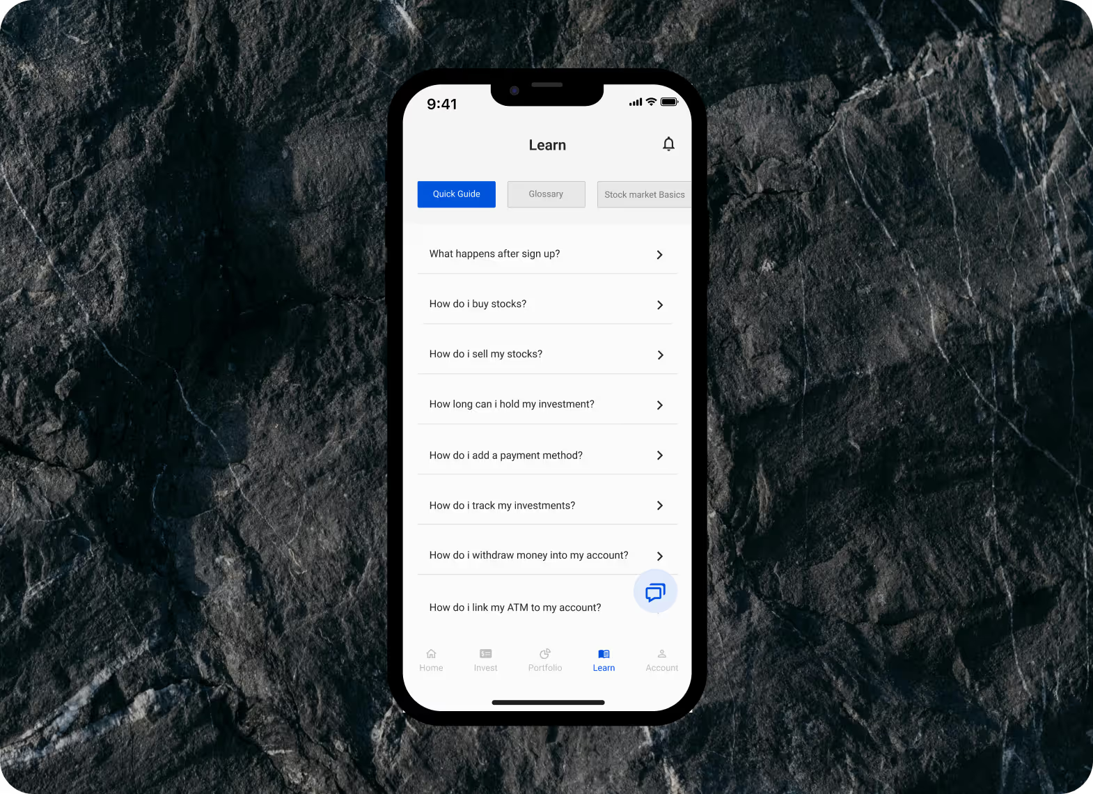
Making Learning a Priority
I knew from the start that if users couldn’t understand how investing worked, they wouldn’t feel confident taking action. So I built a “Learn” section, filled with straightforward answers to real questions beginners ask—like “How do I buy stocks?” or “How do I track my investments?” I didn’t want it buried deep in the app; I wanted learning to feel like a natural first step.
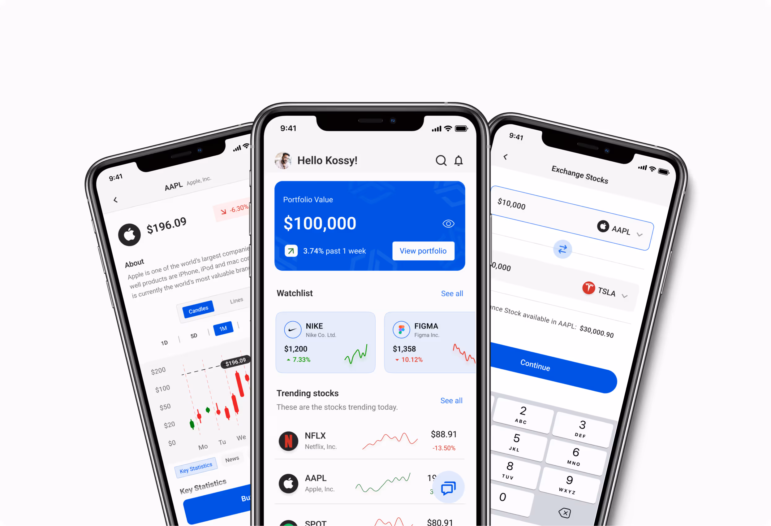
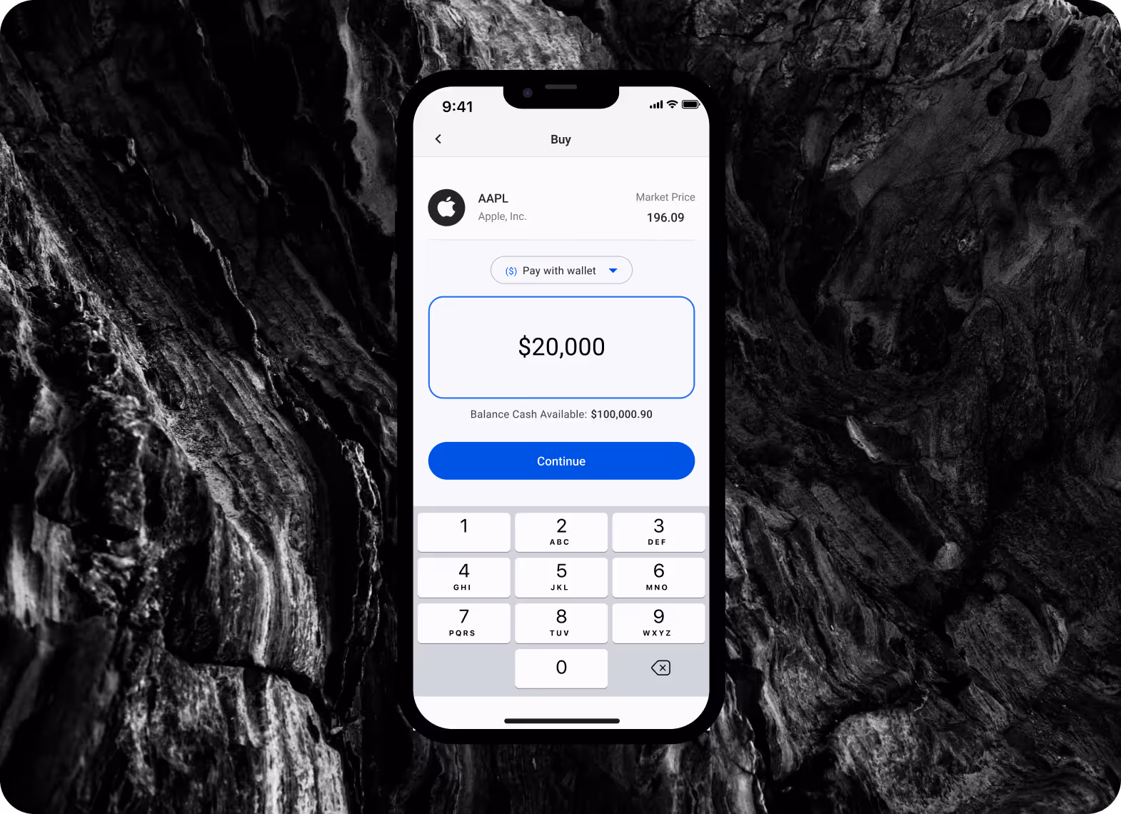
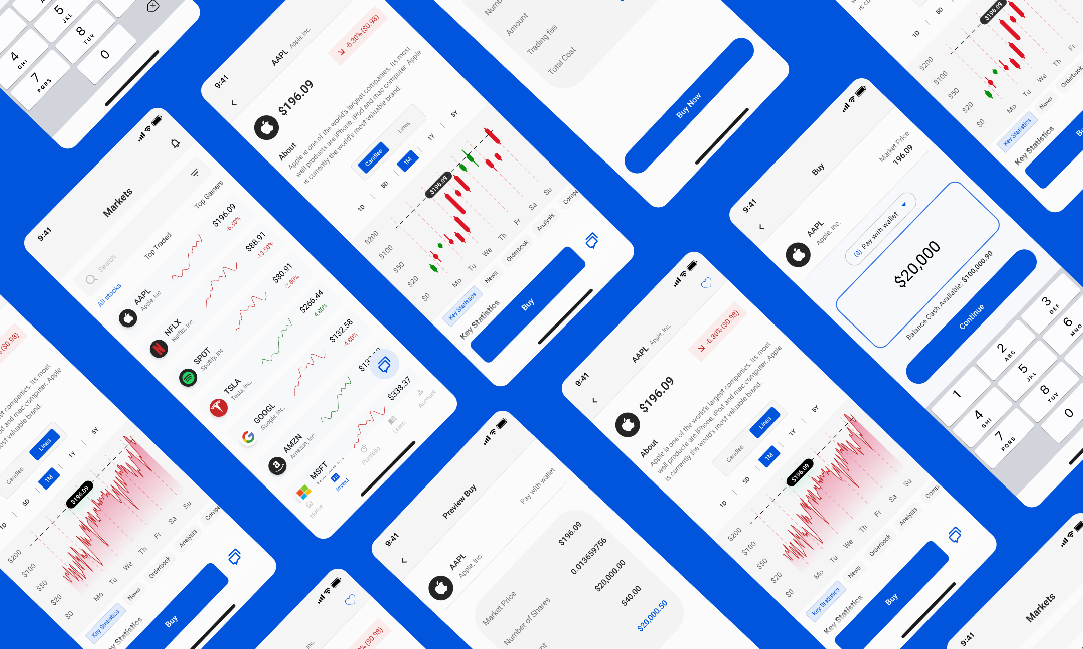
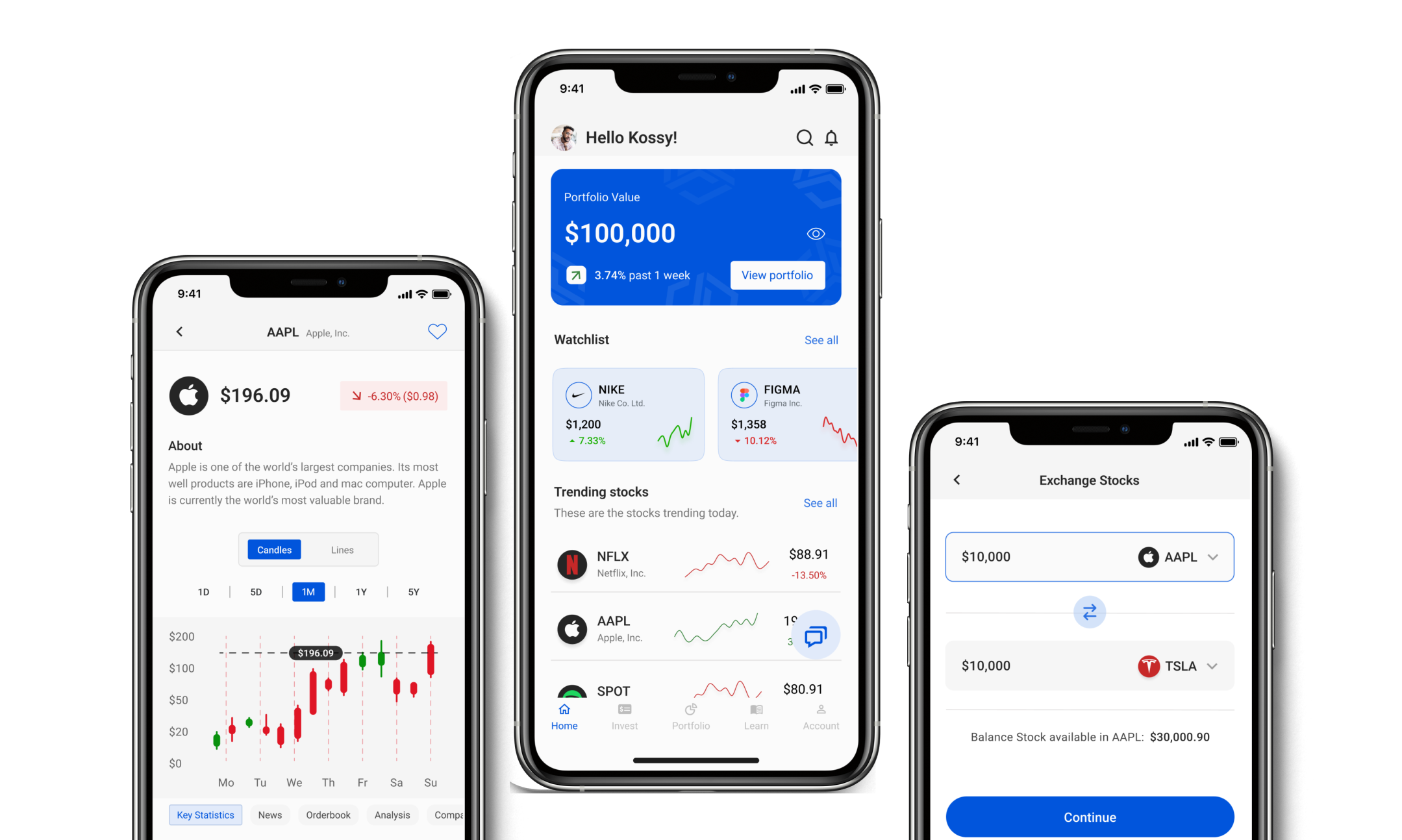
Simplifying the way people buy
At first, I overcomplicated the stock buying page—adding charts, stats, and a bunch of extra options because I thought users would want everything in one place. But after testing, it was clear: people just wanted a fast, simple way to buy without all the noise.
So I stripped it back to the basics: company info, current price, balance, and a big, easy-to-use number pad. I made sure the main action—entering an amount—was front and center, with a clear “Continue” button to keep things moving.
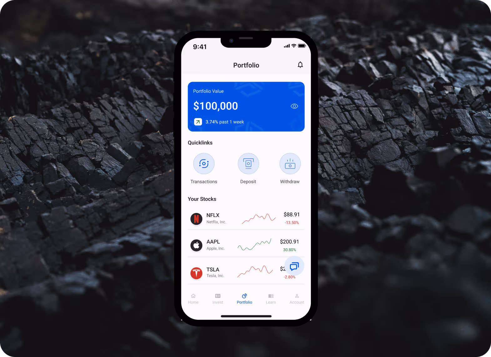
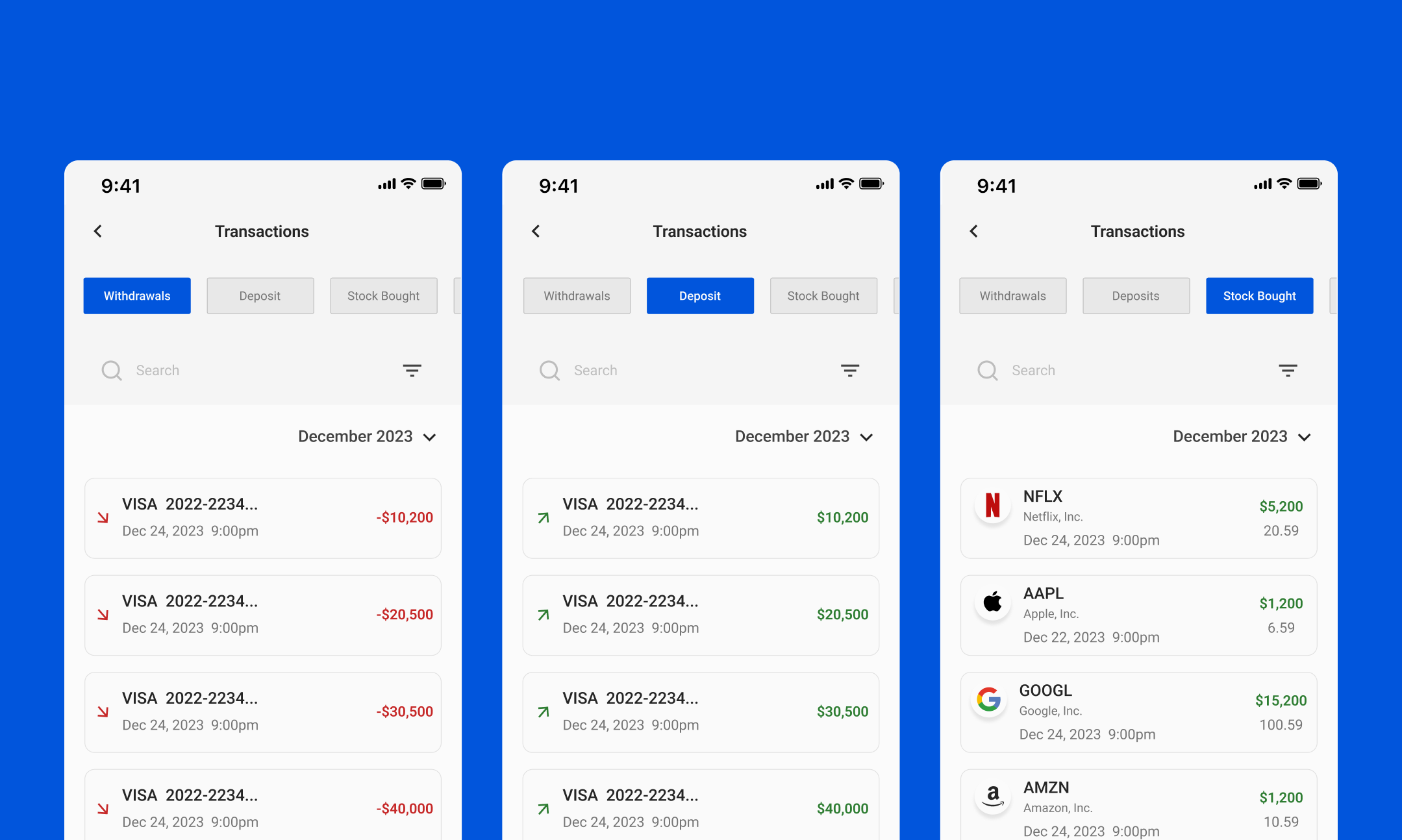
Keeping Money Management Straightforward
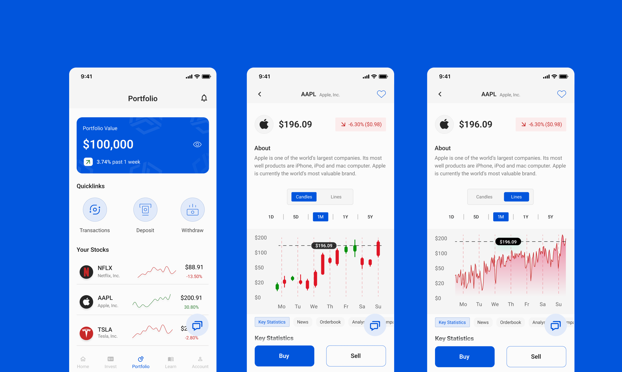
One unexpected challenge was helping users understand where to deposit money. Some testers missed the deposit option entirely in my early designs. I fixed this by placing a clear “Deposit” button right on the portfolio screen, alongside other quick actions. That small tweak made it much more visible and intuitive.
Throughout the process, I kept testing with friends and beginner investors, listening closely to their struggles and adjusting the designs based on their feedback. Every round of testing helped me make the app clearer, cleaner, and easier to use.
IMPACT
Even though Stocka is a personal project, it taught me so much about simplifying complexity and designing with empathy. It pushed me to think beyond just features and focus on how users feel when they interact with a product—especially users who are new, hesitant, or nervous.
Hearing people say things like “this makes stocks feel less intimidating” or “I’d actually try investing if it looked like this” was the biggest win for me.
NEXT CASE STUDY