JUST
PROJECTS
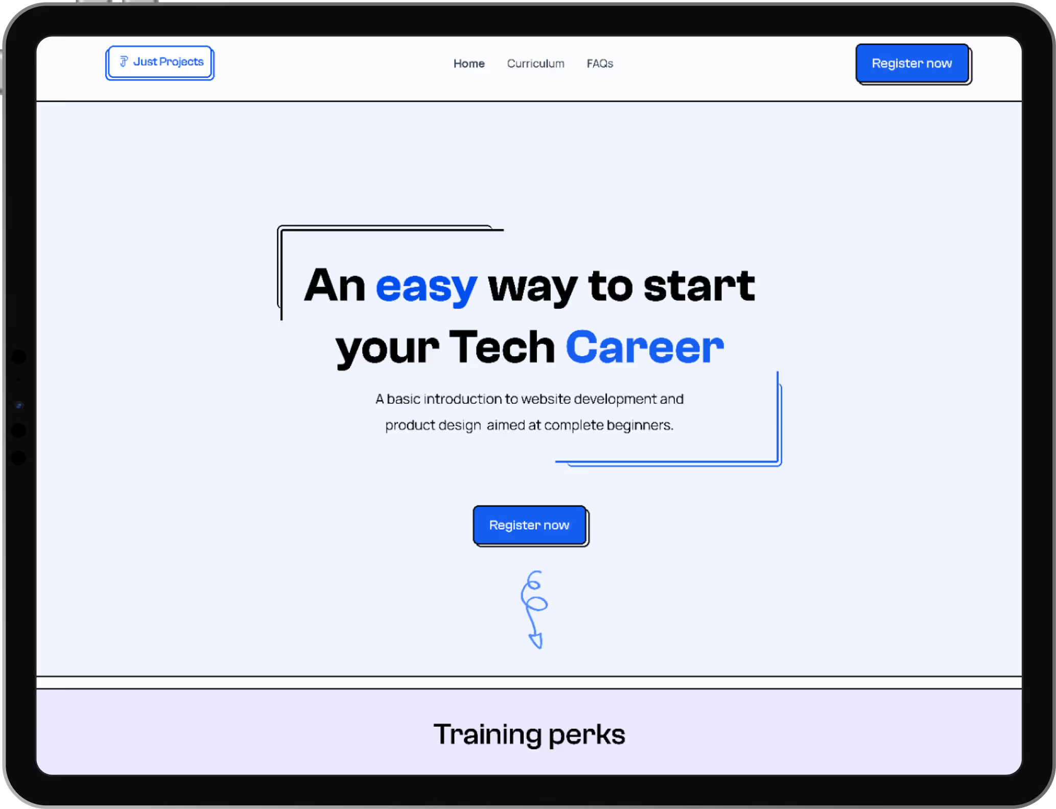
During my time as a product designer at Just Projects (a 3-month role), I had the opportunity to help create an intuitive and beginner-friendly website aimed at people interested in learning new skills in product design and web development. The goal was to make it simple for users to register and start their learning journey without feeling overwhelmed.
From the start, we wanted the platform to feel approachable and easy to use, especially since we knew most users would be complete beginners to tech.

THE CHALLENGE
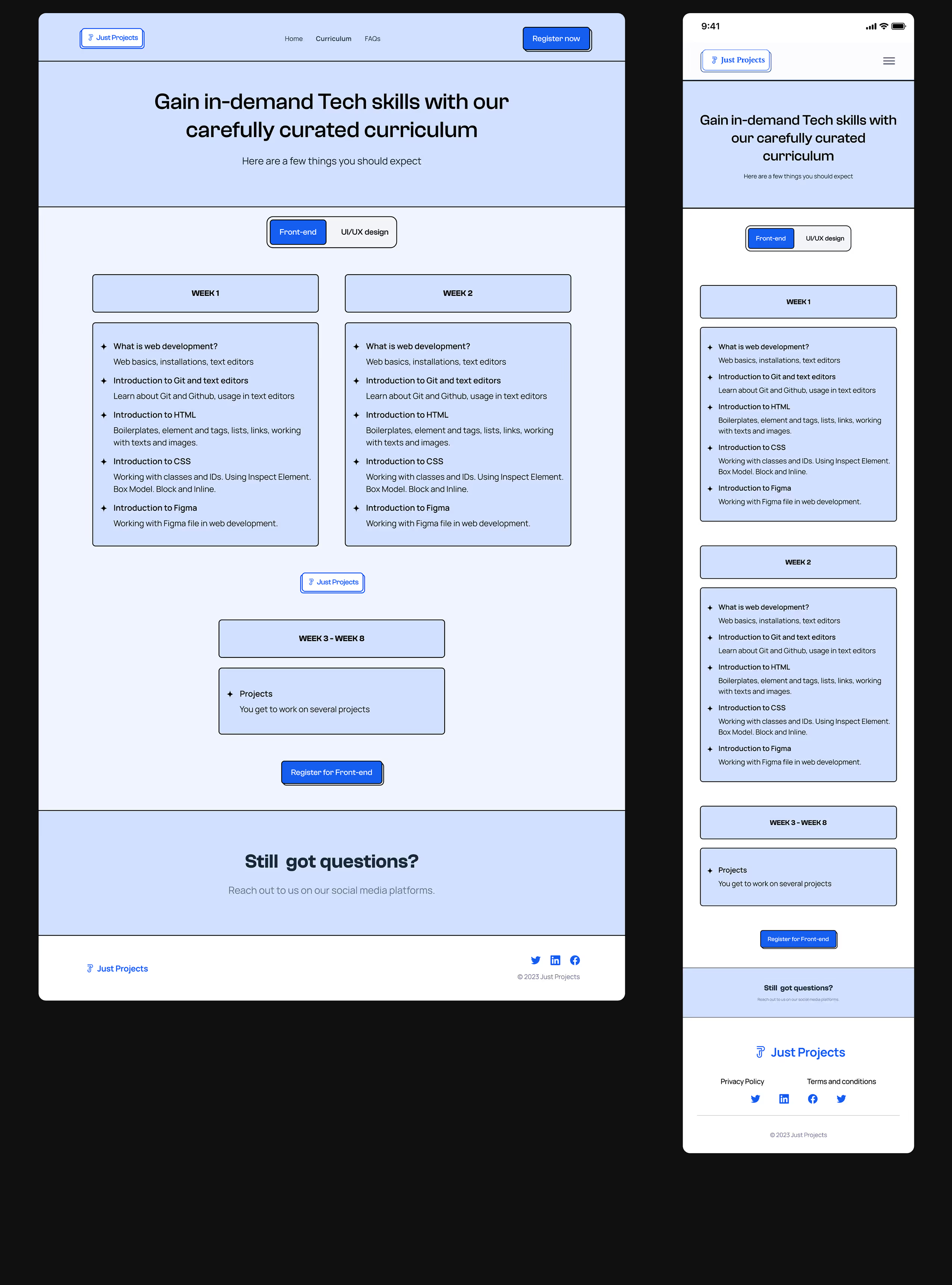
One of the biggest challenges we faced early on was figuring out how to structure the website in a way that felt clear and not confusing. We needed to give users enough information about the courses and benefits, while still keeping the process simple.
We also ran into issues with the landing page. After testing, users told us it looked “a bit playful” and didn’t feel serious enough for a learning platform. It didn’t build the kind of trust we wanted for a website helping people invest in their education.
MY APPROACH
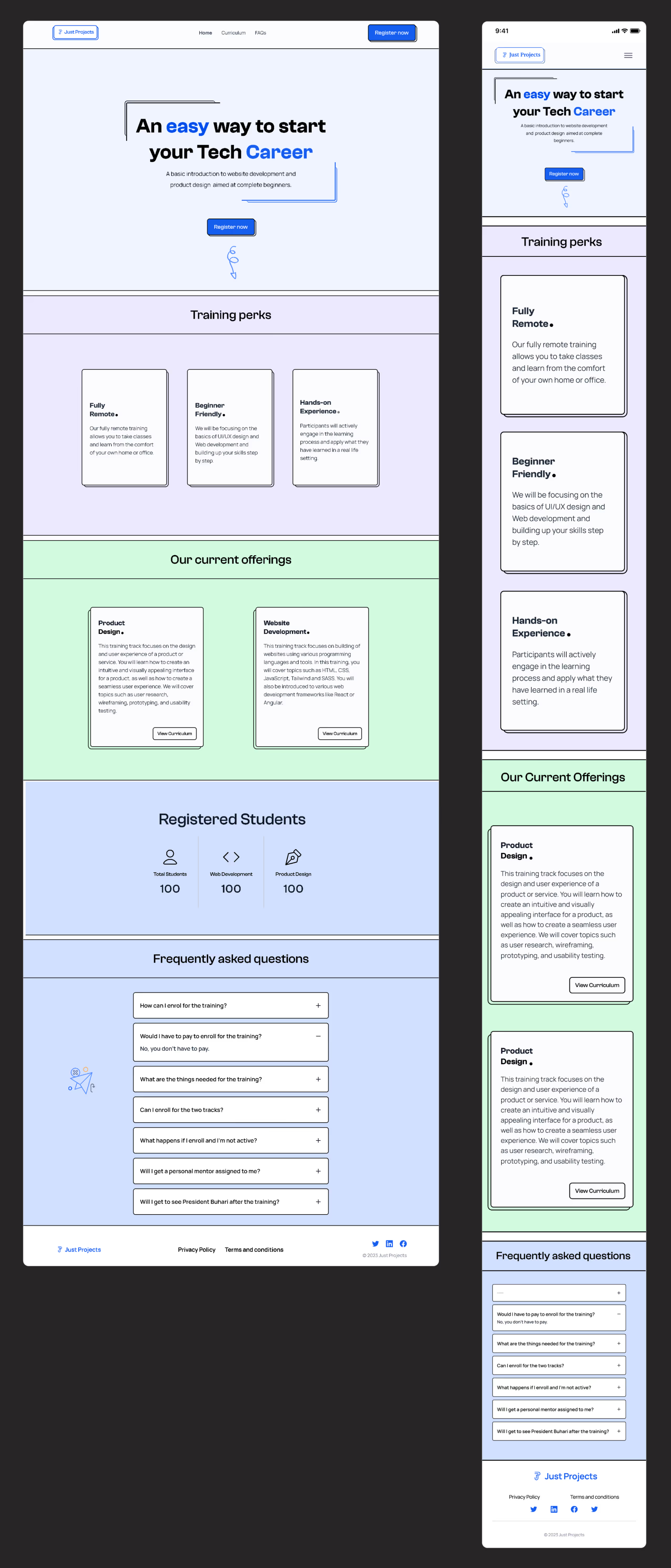
To tackle these challenges, my team and I spent time researching how other beginner-focused platforms handled onboarding. We mapped out the user flow to identify where users might get stuck or drop off. Then we created wireframes to test the overall structure and layout before diving into visuals.
We developed low-fidelity prototypes to get early feedback and made adjustments based on what users told us. For example, we simplified the navigation and grouped related information so users wouldn’t feel overwhelmed with choices.
When it came to redesigning the landing page, we toned down the colors, refined the typography, and gave the visuals a more professional feel. These changes made the page feel more trustworthy, and users described it as “clean” and “easy to understand” in follow-up testing.
We developed low-fidelity prototypes to get early feedback and made adjustments based on what users told us.
For example, we simplified the navigation and grouped related information so users wouldn’t feel overwhelmed with choices.
IMPACT
After launching, the website saw great results—over 3,000 users registered in the first month. Seeing that kind of response reassured us that the design choices we made really connected with our audience.
It also showed the power of listening to user feedback and focusing on simplicity.
NEXT CASE STUDY