FINOMABILITY
As a student, I realized how hard it was to get real-world experience before graduation. It wasn’t from a lack of ambition—many of us were eager to apply what we’d learned. But finding opportunities felt frustrating and confusing. I kept hearing the same thing from classmates: “I’d love to work on real projects, but where do I even start?”
At the same time, I saw how much our educators wanted to help us grow beyond the classroom. The problem? They didn’t always have the right tools or connections. And while some businesses were open to mentoring or collaborating, there wasn’t a clear way for them to reach students directly.
That gap is what sparked the idea behind Finomability—a collaborative platform that brings students, educators, and industry partners into one space. Our goal was to simplify how these three groups connect and collaborate on real-world projects, turning student learning into real-world experience.

THE CHALLENGE
STUDENTS
Educators
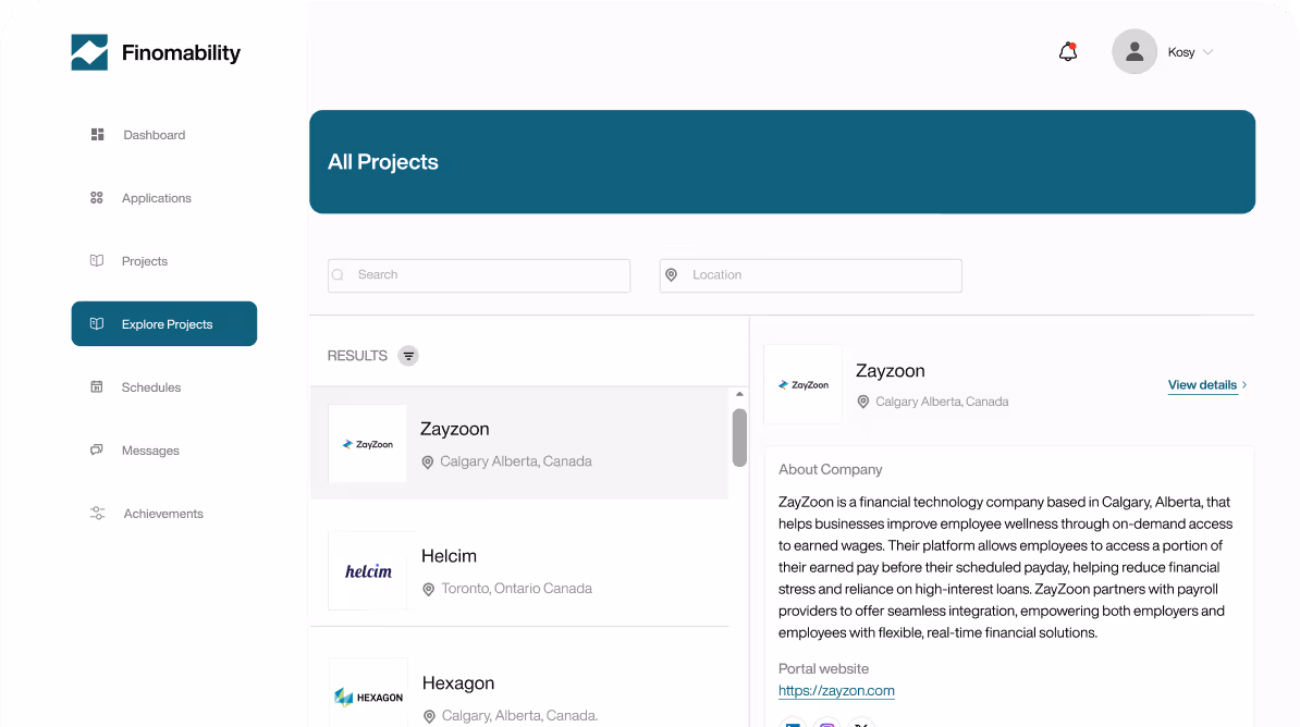
Industry partners
This research helped us spot key gaps—like clunky onboarding, lack of educator tools, or project discovery that felt overwhelming.
To validate our design ideas early, we tested our platform with all three user types—students, educators, and industry partners. Their feedback played a huge role in shaping the way each feature was designed.
It became clear early on: this wasn’t just about visuals—it was a bigger problem around clarity and ease of use. The solution had to be clean, scalable, and intuitive across all touchpoints.
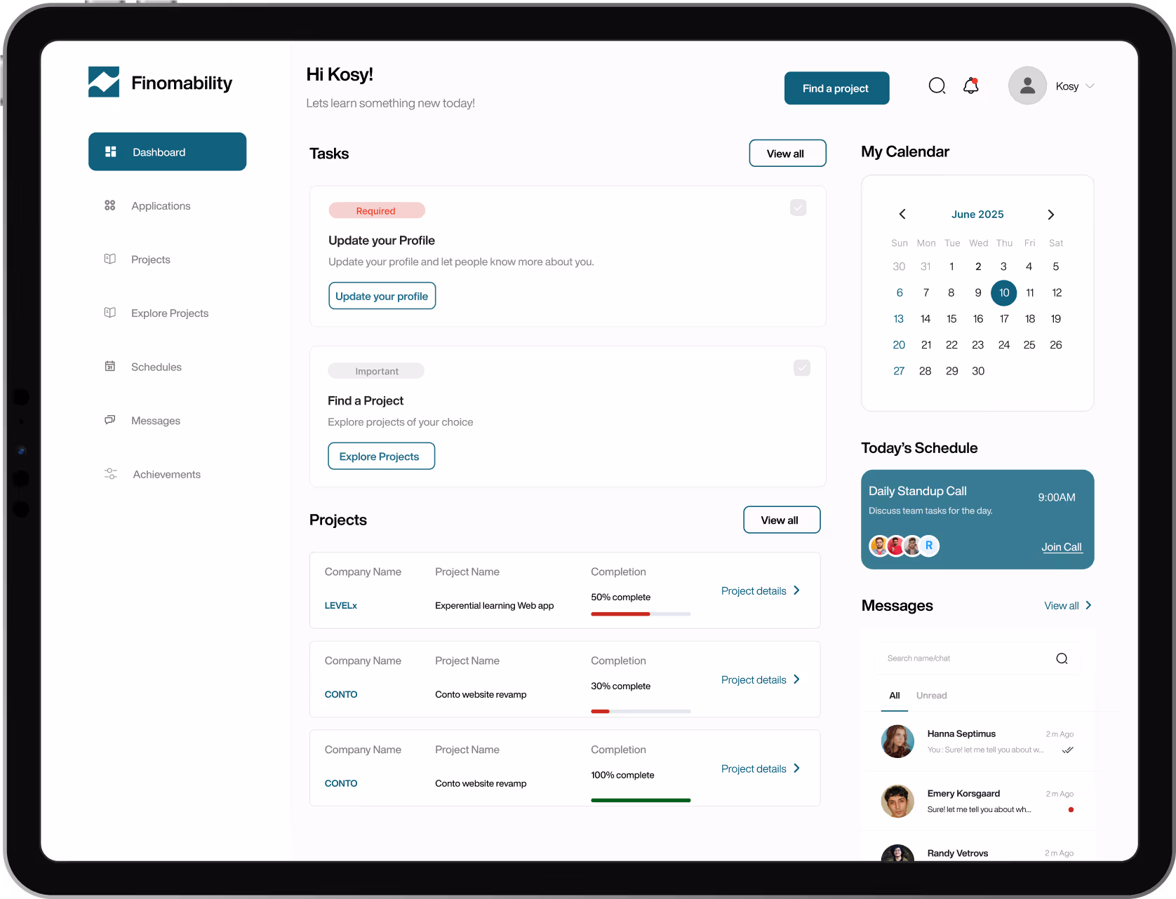
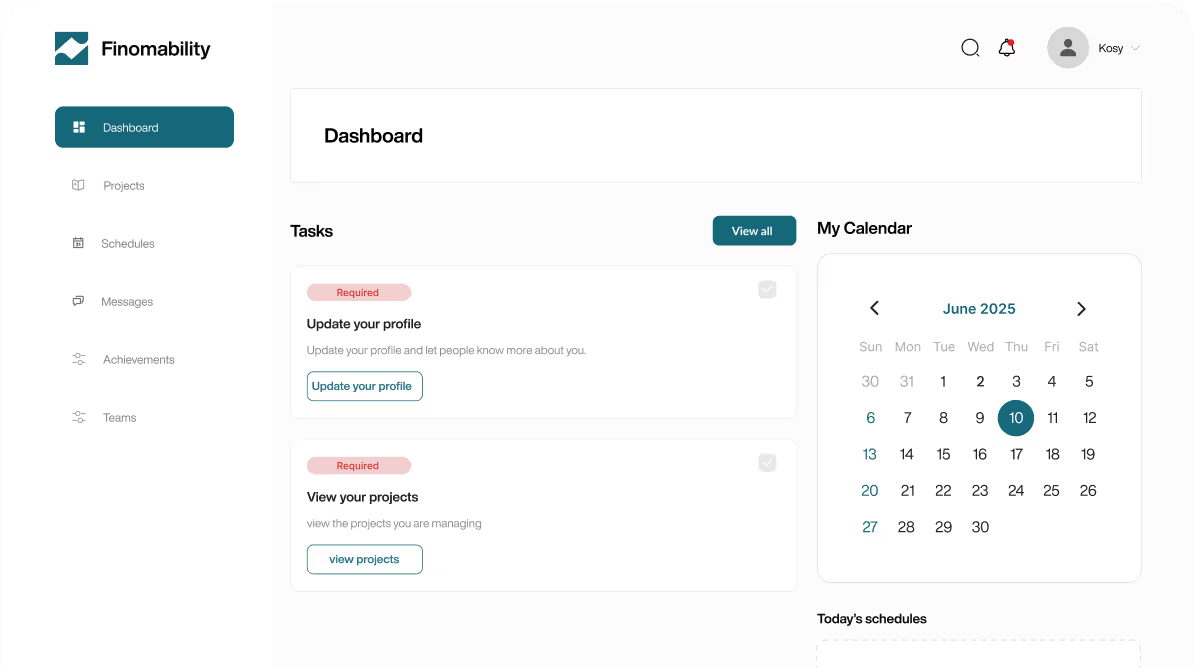
My Approach
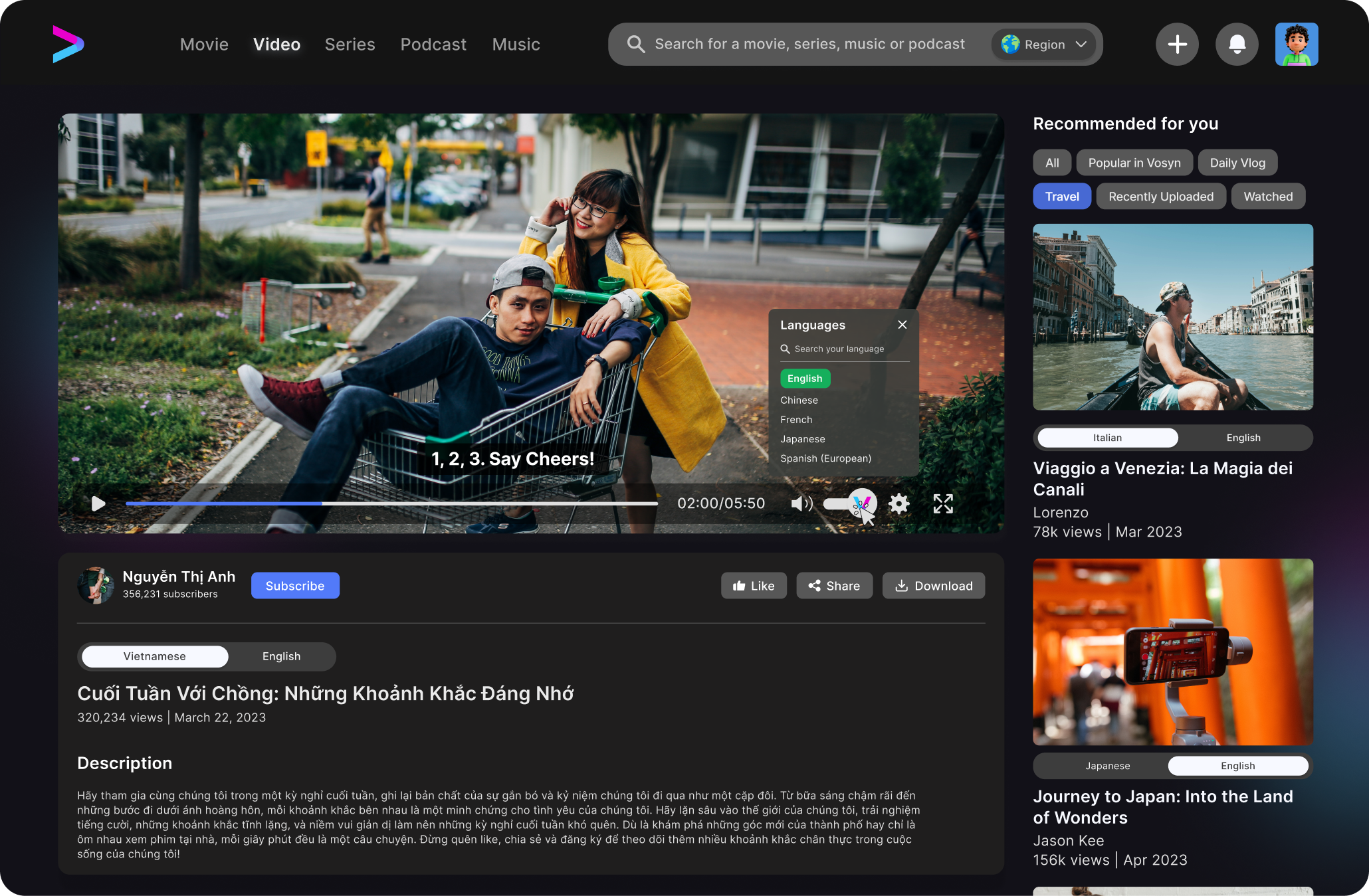
Designing for Students
Simplifying the student experience
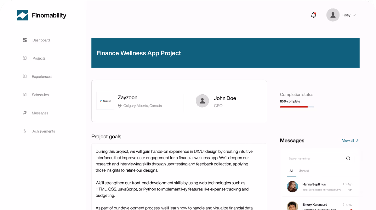
Making Applications Feel Effortless
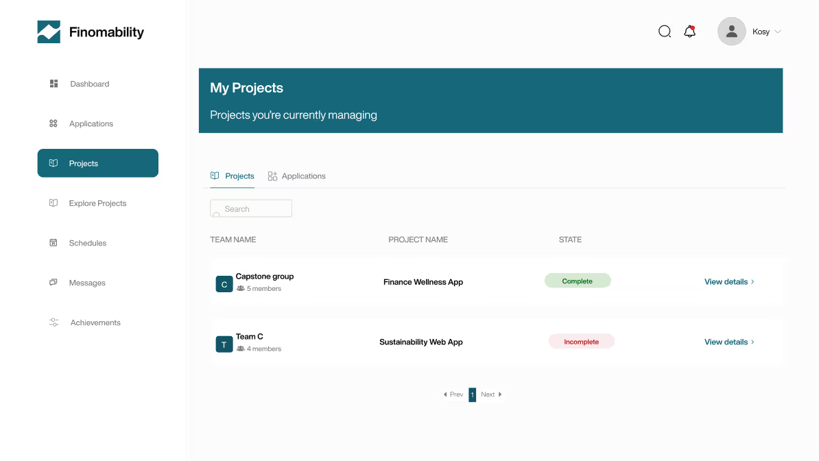
Rethinking Project Discovery
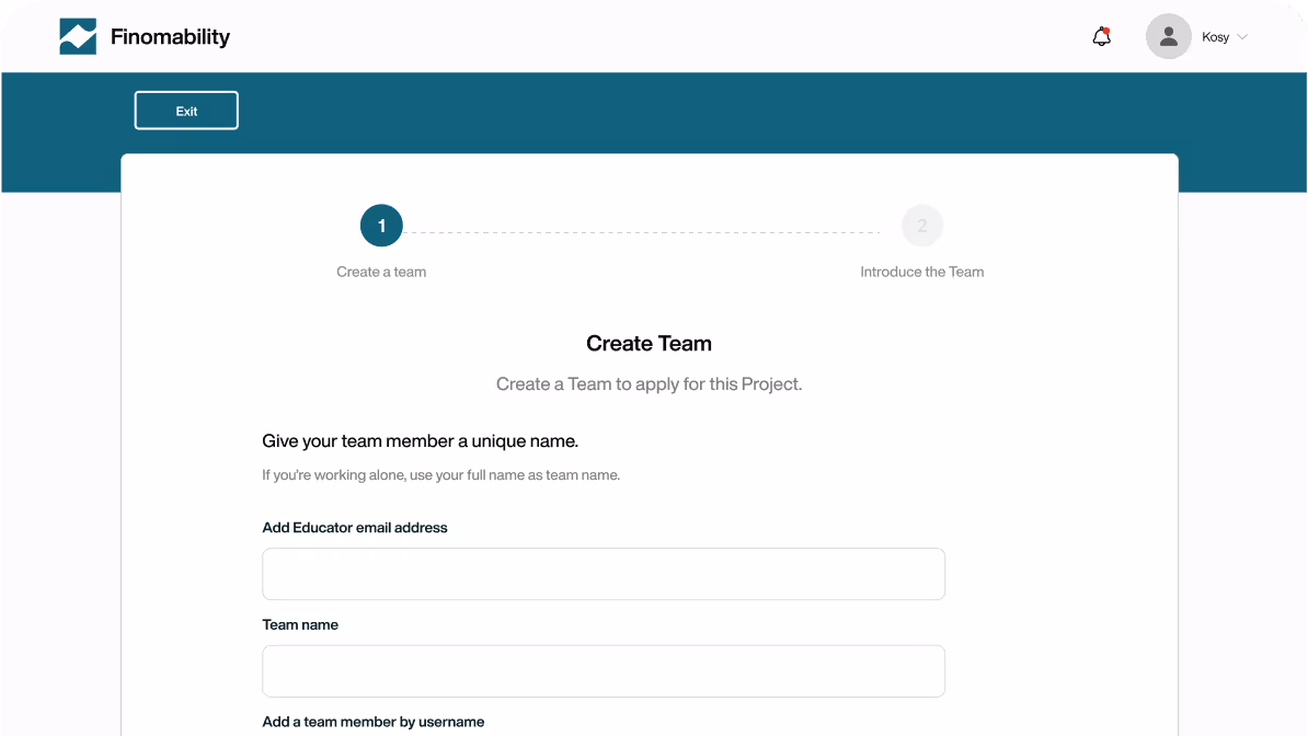
for Industry Partners
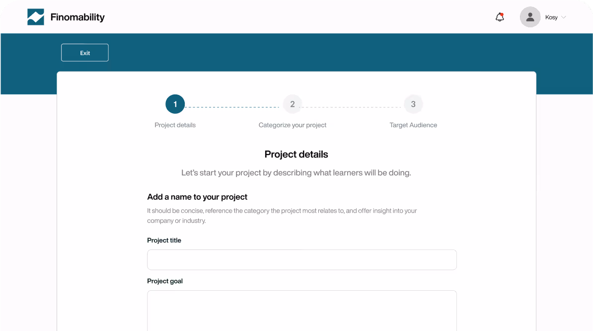
A Smoother Project Posting Flow
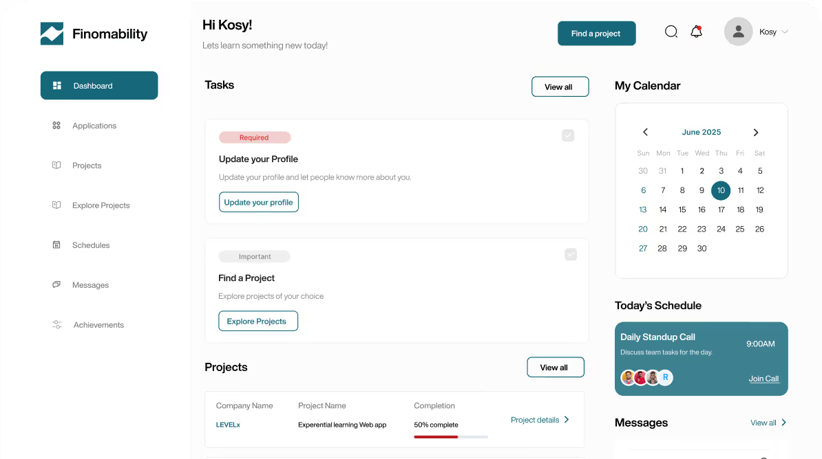
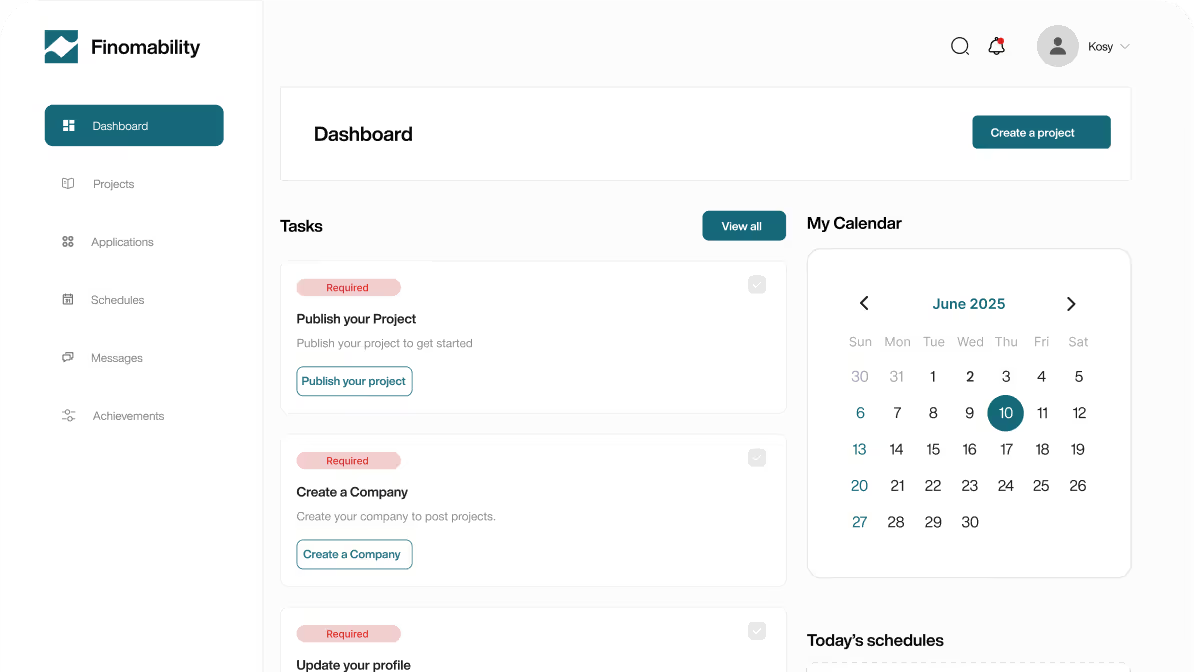
A Dashboard That Stays on Track
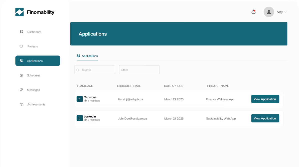
Application Review, Made Simple
Designing for Educators
Just the Right Level of Control
Managing Multiple Teams with Ease
Information That’s Easy to Digest
Impact
We had the chance to showcase Finomability at SAIT’s Capstone Fair, and the response was beyond what we expected. Educators, students, and visitors showed genuine interest, and the Academic Chair of IT personally highlighted its potential. That sparked deeper conversations about how the platform could be used outside of SAIT. The feedback even led to connections with the University of Calgary, where we began exploring ways to share Finomability with a much wider audience.
NEXT CASE STUDY